Kaizen — Continuous, Personal Growth
Welcome to Kaizen, a self-directed platform for professional development. Named after the Japanese concept meaning “change for the better,” Kaizen is built around continuous improvement — but with a human-first twist. In today’s workplace, feedback often feels broken and overly focused on company-led reviews. Kaizen redefines that: delivering private, anonymous, and ongoing feedback to empower individuals in a constructive, uplifting way.
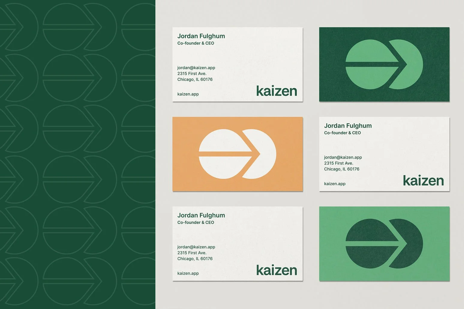
After securing seed funding, our mission evolved: refine the app and brand identity to foster trust, warmth, and emotional connection. We set out to design a visual system that reflected Kaizen’s core values—approachable, personal, transformative—drawing inspiration from Japanese wabi‑sabi and minimalist aesthetics.
Simplicity & Authenticity
Embracing wabi‑sabi’s beauty in imperfection, we used natural textures, asymmetry, and muted, earthy tones to evoke a sense of genuine warmth, calm, and trust
Organic, Thoughtful Touches
From hand-crafted iconography to gently rounded shapes, every visual element reinforces that Kaizen is built for real people seeking growth—not rigid corporate systems .
Timeless & Tranquil Identity
Inspired by Zen principles like serenity and modest elegance, the brand palette and typography create an environment that feels quietly uplifting and supportive