After initial conversations with the client and a deep dive into the company’s mission and market, it became clear that the brand needed to strike a balance between a professional, corporate tone and a forward-thinking appeal to the tech sector. The visual identity needed to embody qualities like speed, agility, and intelligence—core traits of both the company and its approach to innovation.
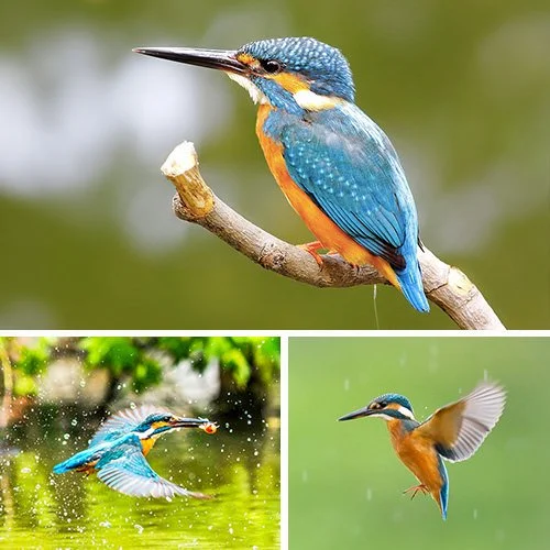
As we explored potential symbolism, we turned to the animal kingdom for inspiration. The kingfisher stood out: small yet fast, focused, and highly effective. It became the perfect metaphor for a company that uses technology and data to efficiently locate top-tier human capital.
I began sketching abstract interpretations of the kingfisher, focusing especially on wing forms. Initially working with curves, I soon realized that angular, sharper shapes better communicated the qualities we were aiming for. The final mark is a minimal, geometric representation of motion and precision, paired with clean sans-serif typography to reinforce the brand’s modern, streamlined personality.

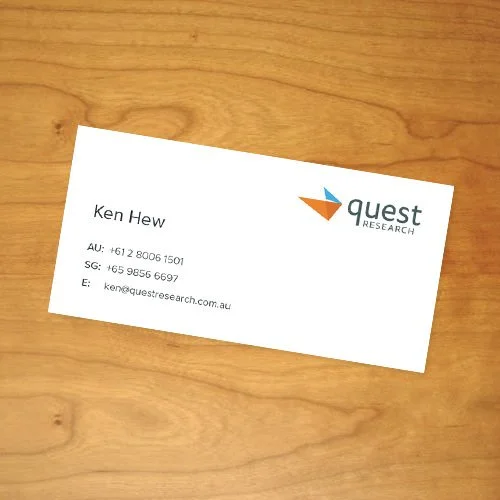

The complementary blue and orange color palette was inspired by the vibrant feathers of the kingfisher, reflecting both energy and clarity. We chose Proxima Nova for its clean, modern versatility, using varying shades of grey to create a refined typographic system. The business cards were kept minimal and elegant, printed on thick matte stock to reinforce the brand’s polished and professional tone.
The visual direction aimed to capture a sense of energy, precision, and elegance. We curated striking imagery of kingfishers in motion—highlighting their swift movements and natural grace—to help express the brand’s dynamic character. Action photography played a key role in conveying agility and strength. For the iconography, we opted for minimal line-based illustrations to introduce a subtle, technical aesthetic that aligned with the company’s focus on innovation.


In addition to developing the brand identity, I was tasked with designing and building a fully responsive website to replace the outdated legacy site. The original site lacked mobile optimization and clarity, so the first step was a thorough audit to evaluate what was effective and what needed improvement.
Fortunately, the existing site was connected to Google Analytics, which provided helpful behavioral data. I also conducted brief user interviews to gather qualitative insights. Key feedback included: the site was difficult to navigate on mobile, the design felt outdated and cluttered, and users struggled to locate important information.
While the visual and technical issues were straightforward to address with a modern, responsive design, solving the content discovery problem required a more strategic approach. Before diving into design, I worked to clarify the site’s purpose: What are users trying to accomplish? How can the website deliver that value clearly and quickly?
Using insights from interviews, analytics, and competitor benchmarking, I structured the content around what mattered most to users. The solution was a streamlined one-page site, divided into five distinct sections, each accessible via anchored navigation. I designed the layout with a fluid two-column structure for desktop that collapsed seamlessly into a single-column layout for mobile devices.
Early wireframes helped define the core structure and user flow, providing a solid foundation to iterate on visual design and content hierarchy.


With the brand identity, content, and wireframes in place, the next phase focused on translating the structure into a cohesive visual experience. The design approach was intentionally minimal, placing strong emphasis on typography and content clarity while allowing the brand elements to shine.
Much of the groundwork was already established through wireframing, which made the transition to high-fidelity design smooth and efficient. This stage involved refining the layout, exploring color combinations, and developing custom visual assets to bring the brand to life.
On the homepage, a subtle parallax effect was used to create depth—allowing the kingfisher image to move independently of the background. The navigation was designed as a fixed header that stays visible as users scroll, providing easy access to different sections. To enhance usability and reduce visual clutter, the nav bar automatically hides when scrolling down and reappears when scrolling up, keeping the focus on the content without sacrificing functionality.